O VALE DA VILARIÇA
In the heart of this Valley, some centuries old, is a group of lands and olive trees from where this Oil is obtained.
In the heart of this Valley, some centuries old, is a group of lands and olive trees from where this Oil is obtained.
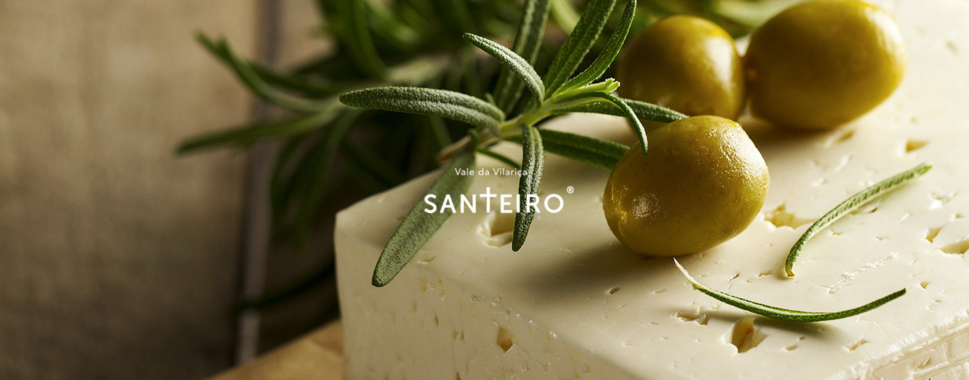
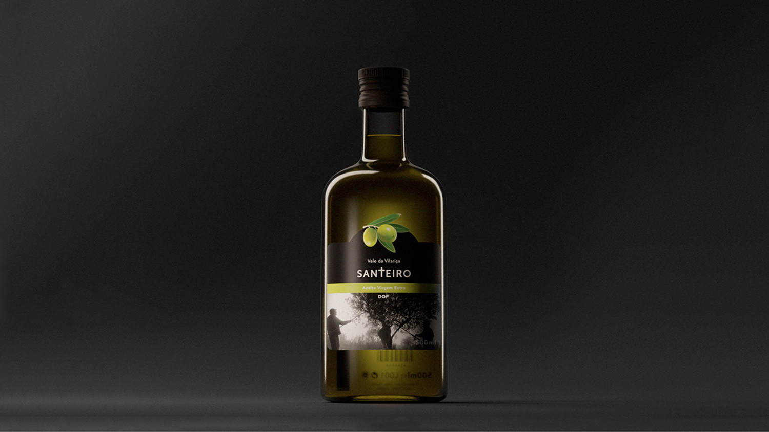
Build up on that quote, Santeiro’s Olive Oil was designed simple and sober true to its origins. Creating an effortlessness label for the already existing bottle to ease the people’s manual hard daily work.


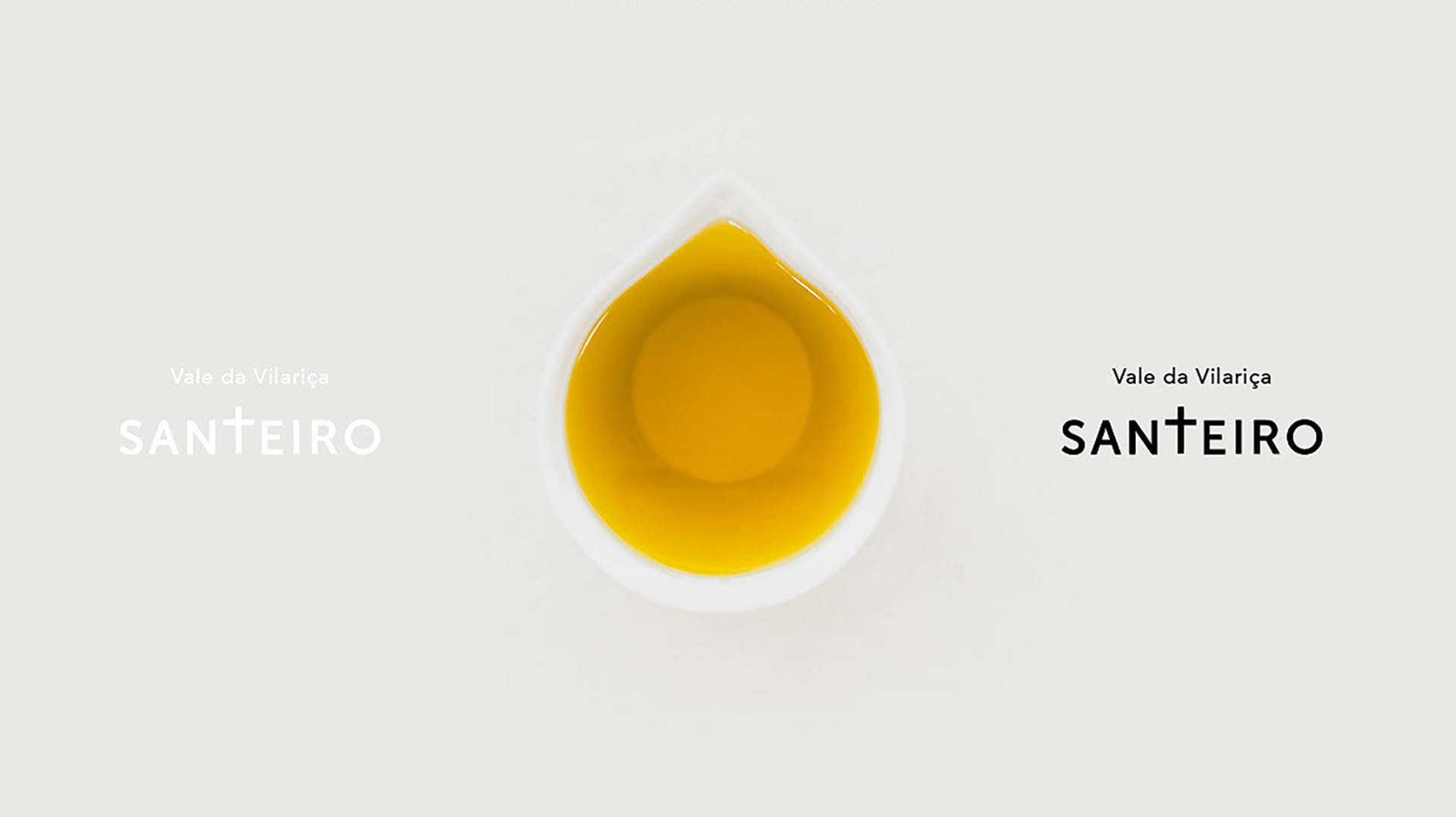
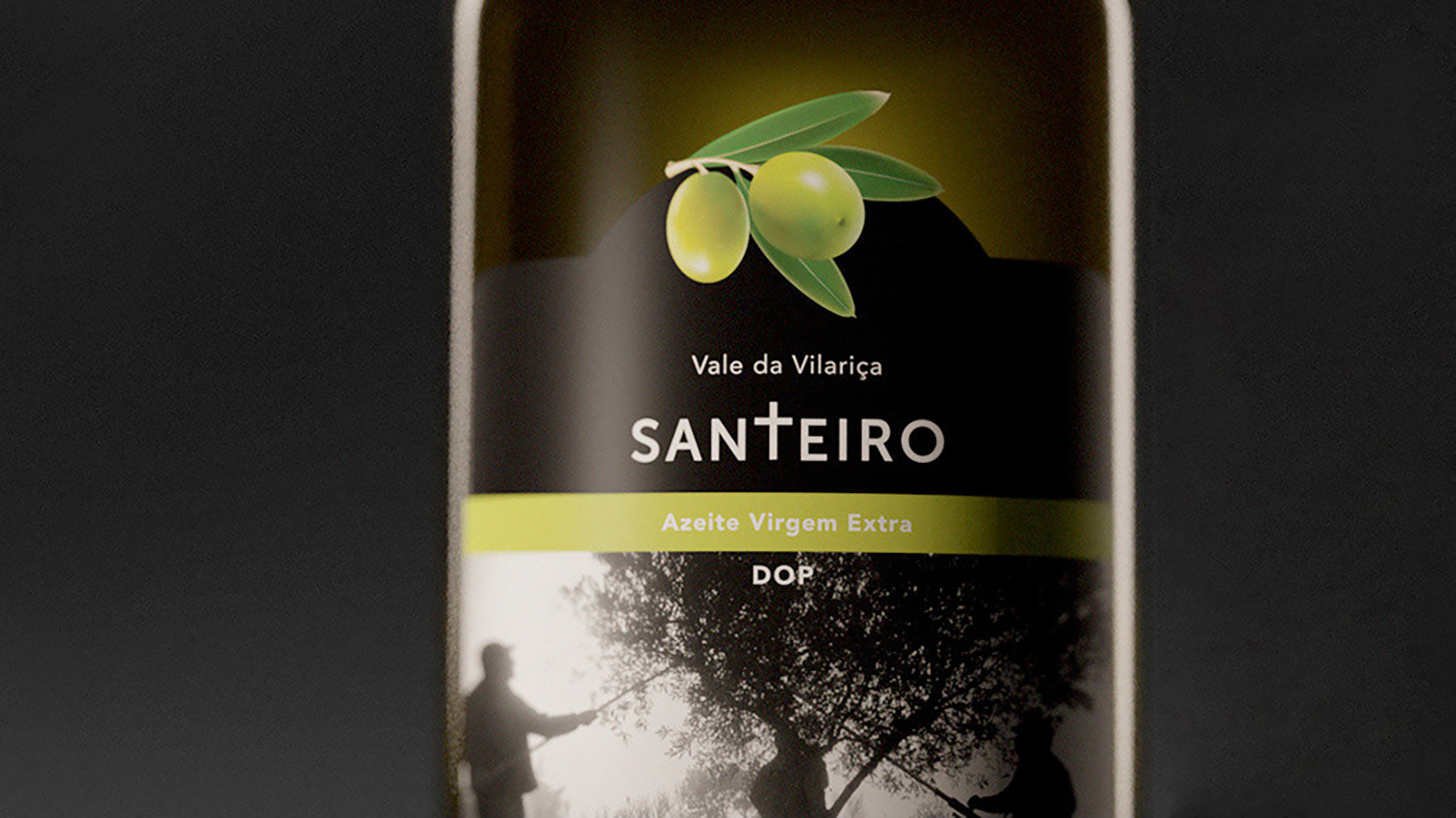
The logo takes the word Santeiro (Saint) literal by designing the “T” as a cross, while keeping it aligned to the remaining lettering.
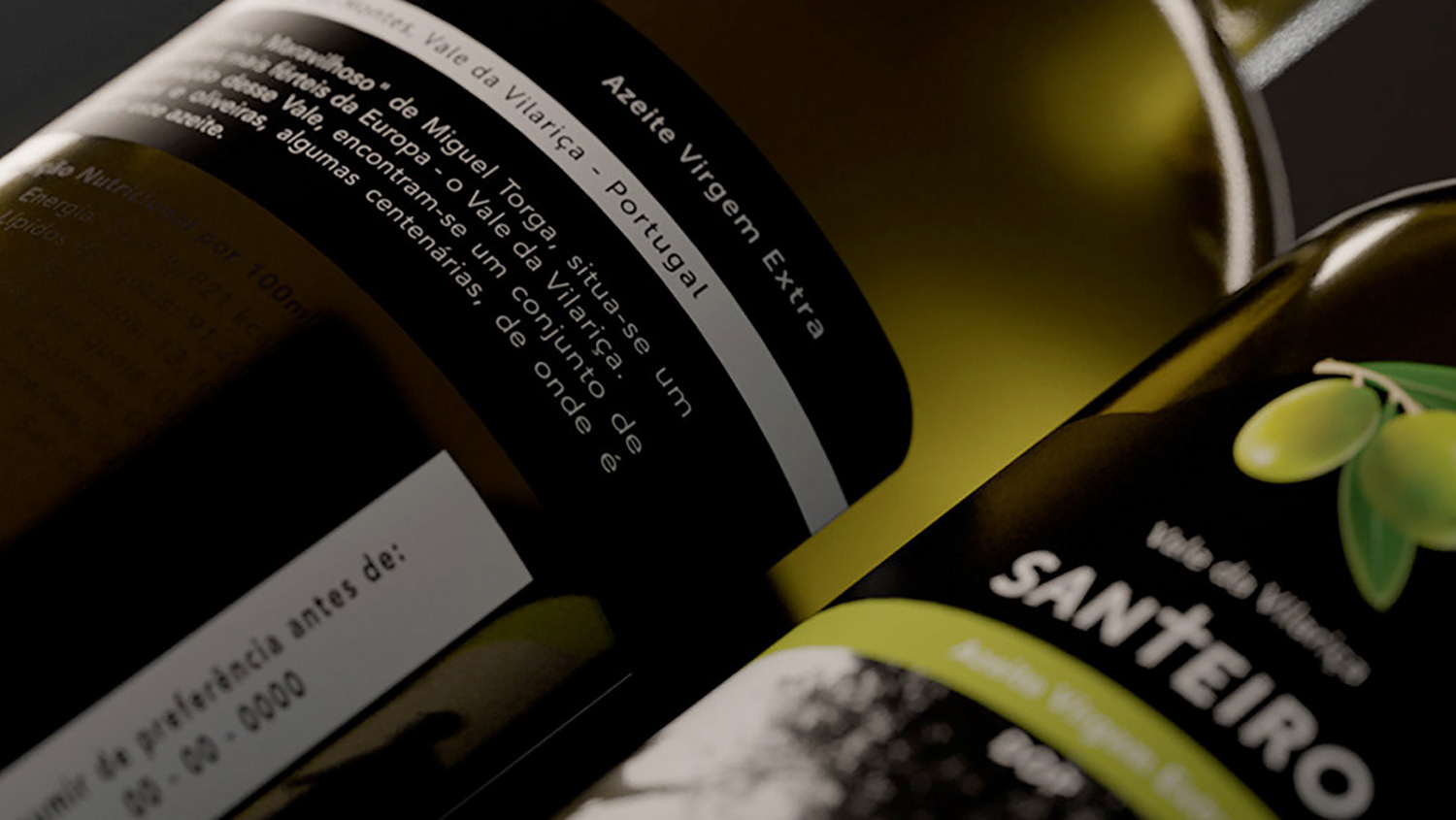
Due to the bottles dark color, lighter earth tones had to be used to contrast with the delivered black and white photo. The final product reflects the owners hard work and passion for their land.
Due to the bottles dark color, lighter earth tones had to be used to contrast with the delivered black and white photo. The final product reflects the owners hard work and passion for their land.